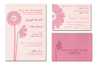
Now that the invitation for the gerber daisy wedding has been chosen, I had to move onto the RSVP card. Once the first element is finished, usually the rest of the designs fall into place easily.
As you can see, if you look at my previous post about these invitations, I have made a few changes. I printed the invitation out on my home printer to get a feel for how it was really going to look. You'd be amazed at how many issues you catch when you look at it on paper as opposed to a computer screen. It also gives you an idea of how the colors are going to turn out.
The first thing I noticed is some spacing issues and a missed period. I quickly fixed it. The bride would not have been thrilled if I made a typo!
Another issue that bothered me as I compared the invitation printout and the RSVP card printout was the colors of the daisies. I used a much subtler pink in the RSVP card and seeing the invitation full size with those bright pink daisies glaring off the page at me was not working. They were distracting, which would cause the reader to barely focus on the type. That truly, is the most important part! So, I changed the opacity to that of the one on the RSVP card. It worked perfectly and tied them together so much better.
For some contrast, I wanted to make the envelopes the darker pink. To make the type show up, I had to use the cranberry color that we picked out for the details. This seemed to worked but the envelope still seemed to be missing something. I decided to add the profile daisy in a lighter cranberry pointing directly at the address, leading your eye to this important information. I think the main envelope will be the darker pink as well, which will look nice with the black calligraphy adorning it.
What do you think?

