Tuesday, December 01, 2009

Gobble Gobble!


I know it seems like I have been neglecting Petit Fig Tree because I haven't posted in a while.  The truth is, I've had multiple projects up my sleeve, two being holiday cards, one holiday open house invitation and a Turkey Trot logo that was printed on tee-shirts.  

I would love to show off the holiday cards and open house invitation but considering they have yet to be sent, I don't want to ruin the surprise for the potential recipients.  

I will, however, show off the SPD Turkey Trot logo.  This inventive idea came from Justin, the client.   SPD is essentially a group of runners within a family, spanning the United States.  They have a forum where they can post their trials and tribulations when it comes to running,  support each other through the tough times and just keep in touch.  This close-knit family keeps each other going no matter where they are and how many miles they are logging.   

The first Annual Turkey Trot is virtual race. Each person ran on Thanksgiving at whatever pace and mileage they could handle.  The point was, everyone ran and even though they couldn't be together, they were joined in spirit. 

The skull depicts the struggle running brings about, the pain you go through to push through that last mile.  The turkey legs replace the crossbones, illustrating the holiday that it is held on, and the incentive to run those miles in the first place!  

Sunday, September 27, 2009

David Lee Studios


I just updated the David Lee Studios Website which I designed years ago.  If you haven't seen his work, here's his site and I've posted a few pieces so you can get an idea of what he's all about.  

http://www.davidleestudiosusa.com

He's having a show in Chicago on October 17th so if you are in the area or know someone who may be interested, check him out and spread the word.  His work is beautiful
!

Tuesday, September 22, 2009

Mazel Tov!


What's more challenging than designing Bat Mitzvah invitations for someone who is half way between childhood and adulthood?  Designing Bat Mitzvah invitations for a Manhattan thirteen year old!  Kids in New York City grow up fast.  They mature quickly and know what they want out of life at a very young age.   When I started brainstorming for this project, I leaned toward designing for an adolescent, not a sophisticated teenager.   I was definitely put in my place!

Katie is a strong and driven.  At a young(er) age she decided she wanted to become and actor and has since followed through with that dream, taking classes and going to a performing arts school.  She has even performed in some Off-Broadway shows.  I think I was still playing with Barbie and listening to My Little Pony tapes at 13!  She is talented, witty and full of life.   When her mother came to me with this request, giving me an idea of Katie's personality, her likes and dislikes, etc., I started to come up with some ideas. 

Katie loves New York and loves living in the greatest city in the world.  The first invitation illustrates that passion.  Her favorite color is purple which you will see throughout each piece.  New York City is the epitome of drama, excitement and living life to it's fullest.   This, in itself, encompasses Katie's thriving personality.

The piece underneath and the last vertical design are my two "girly" invitations.  Donning the signature purple,  the first is boisterous, glamorous and a bit retro, the latter is more subtle and classic.  I plan to add two tiny rhinestones to the first "girly" design, where some of the round bulbs come out.  This is something that can't be overdone.  Although they are fun and pretty,  any more than that would be distracting.   

Last, but not least, is my very first attempt at the Bat Mitzvah invitation design.  I created this one knowing very little of what Katie wanted,  just what I knew of her from her mom.  I started to think of different types of entertainment... plays, movies, concerts...  then,  suddenly,  I thought of the circus.  I looked up a bunch of vintage circus posters.  Putting a clown or a lion on it would obviously be a bit too childish but the way the type was laid out, the fonts that were used,  all of this contributed to a really interesting idea for an invitation.  The reception is going to be at a comedy club that uses bright oranges and greens in their funky, fun logo so I thought that these two styles went hand in hand.  I replaced the green with our signature color to keep with the theme.  

I think that they all came out really nicely.  There are, of course,  some I like more than others, but all in all, a really nice group of designs.  

Friday, September 04, 2009

Identifying One's Self

A few months ago my cousin, Christine, approached me with a request.  She will soon be graduating from college and applying for jobs.  She asked me to create an identity for her, a trademark that encompasses everything she is and what she has to offer, to be used on letterheads and business cards.

The challenge with this project was confining my design to something that could be used in a world that did not involve art as well as capturing Christine's dynamic personality.  It had to be serious and refined, unlike something I would create for a design position, where your resume is a work of art in itself. I started to explore the idea of monograms. Christine works hard and plays hard.  She is strong, sophisticated and gregarious.  I've never met a girl who could make friends so easily.  She walks in a room and everyone immediately falls in love with her.  

The organic, filigree captures her flirty personality and social tendencies.  The cleanness of the final business card (not shown) characterizes her sophistication and no-nonsense approach to a situation, this girl is all business.  

The Complete Package


After much hard work, the Merrifield wedding went off without a hitch and the bride and groom were very happy!  Above are some of the final elements- invitations, RSVP cards, place cards and table cards.  I have yet to take pictures of the programs, the piece I put the most work into but I'll try to add that later.  

Monday, July 13, 2009

London Calling

My good friend, Megan, has been offered a position in London with her company.  She is leaving her home (and her friends) of many years in New York to start a new life in the UK!   She won't be looking for a place to live until she gets there and will be staying in temporary corporate housing in the meantime.  Because of that, she will have to send out an announcement with her new address, phone number, etc.  I thought, instead of doing something so impersonal, like an e-mail, why not send a postcard in the mail.  What a great gift that would be!  I started designing and this is what I came up with!  

The type, color pallet and boarder were inspired by vintage postcards.  I wanted to give it that 1930s/40s feel.  Big Ben and the Statue of Liberty were perfect icons representing her old home and the new life she is on the cusp of.  On the back, you may recognize the old '80s song by Simple Minds.  I thought this was appropriate.  

Now, Megan has a tendency to put things like this off because she is just so busy with work, and now moving on top of all!  If I could have printed her information on the card beforehand, I would have!  Hopefully she will send these out.  To be safe, I'm buying the stamps as well.  I better get one of these in the mail or someone is in BIG trouble!  I may just have to fly to London and give her a piece of my mind...


Pressing Letters


On Saturday I took a letterpress class in Union Square.  If you don't know much about letterpress, it is basically a form of relief printing that originated in the 15th century, invented by John Gutenburg.  It is crisper and cleaner than anything you could get from a laser printer.  When you run your fingers over the paper, you can feel the difference. There are no computers here, all the type is hand set and the final result is worth the effort.  Check out this link on Wikipedia for more information on the process and this short video on Youtube is very beautiful!  

The class itself was very informative and I found I really loved the process of setting each individual letter of type and learning to run the press.   It was all very therapeutic in a way that photography was for me in college, sitting in a darkroom, watching a blank piece of photo paper come to life.  Computers are much quicker and convenient, but there is something so beautiful about doing things by hand.   It saddens me that so many of these processes have been lost due to technology.  

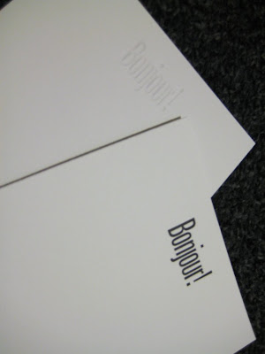
Above are two of the three projects we did.  The quote was a group effort.  my camera doesn't do the embossing or crispness justice and letterpress must really be touched and seen with one's own eyes to really appreciate the beauty and craftmanship.  

The teacher of the class was a 40-something woman with a masters from NYU.  She somehow makes a living printing, designing and teaching this class without any outside income.  She owns the studio and presses.  She takes great pride in her craft, as she should.  She is a true fine artist which, she did not neglect to remind me of over and over throughout the class.   As we went around the room saying who we were, what we did for a living, why we wanted to to take the class, etc, I suddenly felt as though I was in college again.  I was made to feel inadequate because I chose a career that would put food on the table and money in my pocket as opposed to being a starving artist and drawing tourists' portraits on the streets of Times Square.  There are so many people out there that feel this way, that even a career in graphic design as opposed to being a painter or a sculptor is a cop out.  It's like I am a traitor to my artistic background.  So I told her that by day I work in television as an animator/ designer.  She proceded to tell me that TV graphics were annoying and busy (granted, they are a bit flashy, but that's just how TV works!).  I was looked down on for the the standard font we used because it was a "readability " font, in other words, nothing fancy or having much personality.  Of COURSE we use a readability font!  It is television!  It's on the air for three seconds before it is replaced by more information!  What?  Does she think we are going to use some intricate script font that people really have to concentrate on to understand?  This isn't print, these aren't wedding invitations!  I even told her the reason I started Petit Fig Tree was because I wanted to broaden my creativity.  Apparently, that meant nothing to her.   My favorite thing that she said, though, was that if she takes a designer's work to print and decides she doesn't like it, she refuses to do the work.  What a luxury it must be to refuse work or to argue with someone about their own tastes!  On the bright side, I made a friend who was also a graphic designer and got the same elitist vibe from her.  So, it wasn't just me!  Ok, rant over.

All in all, the learning experience was invaluable.  I'm currently looking online for presses, hand presses, not an electric one like the one we used in class.  In only a few projects, the press would pay for itself and the quality and beauty is unsurpassed.