Showing posts with label wedding. Show all posts

Friday, September 04, 2009

The Complete Package


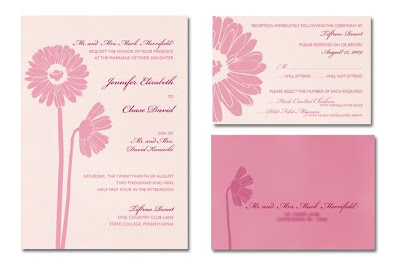
After much hard work, the Merrifield wedding went off without a hitch and the bride and groom were very happy!  Above are some of the final elements- invitations, RSVP cards, place cards and table cards.  I have yet to take pictures of the programs, the piece I put the most work into but I'll try to add that later.  

Wednesday, June 03, 2009

Wedding Details


Now that the invitation for the gerber daisy wedding has been chosen, I had to move onto the RSVP card.  Once the first element is finished, usually the rest of the designs fall into place easily.  

As you can see, if you look at my previous post about these invitations, I have made a few changes. I printed the invitation out on my home printer to get a feel for how it was really going to look.  You'd be amazed at how many issues you catch when you look at it on paper as opposed to a computer screen.  It also gives you an idea of how the colors are going to turn out.  

The first thing I noticed is some spacing issues and a missed period. I quickly fixed it.  The bride would not have been thrilled if I made a typo!   

Another issue that bothered me as I compared the invitation printout and the RSVP card printout was the colors of the daisies.  I used a much subtler pink in the RSVP card and seeing the invitation full size with those bright pink daisies glaring off the page at me was not working.  They were distracting, which would cause the reader to barely focus on the type.  That truly, is the most important part!  So, I changed the opacity to that of the one on the RSVP card.  It worked perfectly and tied them together so much better.  

For some contrast, I wanted to make the envelopes the darker pink.  To make the type show up, I had to use the cranberry color that we picked out for the details.  This seemed to worked but the envelope still seemed to be missing something.  I decided to add the profile daisy in a lighter cranberry pointing directly at the address, leading your eye to this important information.  I think the main envelope will be the darker pink as well, which will look nice with the black calligraphy adorning it. 

What do you think?  

Wednesday, May 27, 2009

Hiatus

Due to some personal issues, I had to take a hiatus from Petit Fig Tree Designs.  I, unfortunately, missed out on two potentially great projects.  

The first was a desk set with personalized logo.  It was for a retired teacher who was planning to do some work from home.  It would have included post-its, notepads,  stationary, etc.  The problem I was having (on top of my personal issues) was the fact that I couldn't find a printer that would print five post-it pads or three notepads.  Everything had to be printed in bulk. Because of this, the project was not very cost effective.

The second project that I ended up forgoing was a website for a real estate developer.   It was going to be a simple, seven page site showing the homes with details and pictures, a home page and a contact page.  The client wanted it finished in three weeks which would have been a crunch but I could have done it under different circumstances.  It's unfortunate that I missed this opportunity.  

So, it's back to finishing up the Merrifield wedding invitations.  The bride chose the vertical invitation with the two daisies side by side, shown here.  This weekend I'm going to work on the RSVP card and envelope.  I also have to order the paper which is a shimmery pale, peachy pink color.  I think I may make the envelope and RSVP card the darker pink used on the invitation, depending on how well it reads.  The final elements are not quite such a rush.  I have to lay out and come up with an idea for the program and start working on the seating chart and place cards.  

As a side project, I really need to redesign the Petit Fig Tree website.  Now that I have learned a decent amount of HTML, the site won't be half has difficult to update when I redo it.  I want to add a link to the blog and I have a few more pieces of work to add to the portfolio.  The news page needs to be updated badly as well.  I like the style I have on the current site and am going to try not to stray too far from that with the new design.  

All in all, things seem to be getting back to normal.  I may have missed out on some great projects but it will just make way for others that I can give 100% to.  


Friday, April 03, 2009

Gerber Daisies


My current project is wedding invitations due in late August.  The bride expressed an interest in pinks and cranberry and she loves gerber daisies.  Actually, Jenny is a gerber daisy.  If people and flowers had kindred personalities, these two would be a perfect match.  Jenny is adorable, blonde and all-American.  She has freckles and bright blue eyes.  Her personality is upbeat and fun-loving.  Gerber daisies have that same feel to them, they are uncomplicated (not that Jenny doesn't have her moments), full of color and cheer.  They bring smiles and happiness. 

Taking all of this into consideration, I had to figure out how I was going to use those daisies in such a way that conveys happiness but shows a touch of sophistication as well.   I took tons of pictures of the daisies, I scanned them in on my scanner.  Then I started working with the photos in Photoshop.  Overlaying and de-saturating  wasn't giving the effect I wanted.  Deep down inside I knew that I was going to have to bite the bullet and trace each and every petal.  Once I exhausted all other options,  I started- one petal, then two, until about an hour and a half later the entire flower was traced and looking wonderfully pink, the pink we decided on.   I started working with this new image and then realized that another daisy would be great as well, so I opened up my file of daisy pictures and chose one that was in profile.  This one didn't take half as long.  

The type layout was key.  It had to be super sophisticated. The gerber daisy is lovely and sweet but does not have the grace of, say a peony.   The fonts I ended up using were Gill Sans or Cambria to counteract the complexities of the script font, Bickham.  After coming up with multiple type layouts that I was happy with,  I added daisies to four different versions of the invitation. 

I was really happy with how these came out.  I sent them to my client last night and now I am awaiting her reply. Hopefully she is happy and we can move on to RSVP cards, programs and place cards!   I'll keep you posted.