What's more challenging than designing Bat Mitzvah invitations for someone who is half way between childhood and adulthood? Designing Bat Mitzvah invitations for a Manhattan thirteen year old! Kids in New York City grow up fast. They mature quickly and know what they want out of life at a very young age. When I started brainstorming for this project, I leaned toward designing for an adolescent, not a sophisticated teenager. I was definitely put in my place!
Katie is a strong and driven. At a young(er) age she decided she wanted to become and actor and has since followed through with that dream, taking classes and going to a performing arts school. She has even performed in some Off-Broadway shows. I think I was still playing with Barbie and listening to My Little Pony tapes at 13! She is talented, witty and full of life. When her mother came to me with this request, giving me an idea of Katie's personality, her likes and dislikes, etc., I started to come up with some ideas.
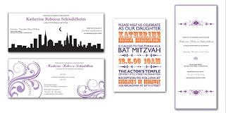
Katie loves New York and loves living in the greatest city in the world. The first invitation illustrates that passion. Her favorite color is purple which you will see throughout each piece. New York City is the epitome of drama, excitement and living life to it's fullest. This, in itself, encompasses Katie's thriving personality.
The piece underneath and the last vertical design are my two "girly" invitations. Donning the signature purple, the first is boisterous, glamorous and a bit retro, the latter is more subtle and classic. I plan to add two tiny rhinestones to the first "girly" design, where some of the round bulbs come out. This is something that can't be overdone. Although they are fun and pretty, any more than that would be distracting.
Last, but not least, is my very first attempt at the Bat Mitzvah invitation design. I created this one knowing very little of what Katie wanted, just what I knew of her from her mom. I started to think of different types of entertainment... plays, movies, concerts... then, suddenly, I thought of the circus. I looked up a bunch of vintage circus posters. Putting a clown or a lion on it would obviously be a bit too childish but the way the type was laid out, the fonts that were used, all of this contributed to a really interesting idea for an invitation. The reception is going to be at a comedy club that uses bright oranges and greens in their funky, fun logo so I thought that these two styles went hand in hand. I replaced the green with our signature color to keep with the theme.
I think that they all came out really nicely. There are, of course, some I like more than others, but all in all, a really nice group of designs.


